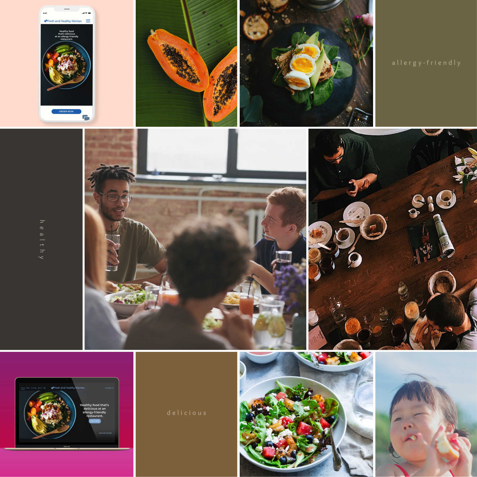
Creating a Seamless User Experience for an Allergy-Friendly Restaurant
Let me share a cool project I worked on recently. It was for this awesome restaurant that's all about tasty, healthy eats and really gets the needs of folks with food allergies. This was actually part of my journey to getting UI/UX certified at the California Institute of the Arts. So, what I did was dive deep into making sure the user experience was top-notch. Picture this: you're browsing the menu and you can check out every ingredient in each dish – super handy, right? Plus, whether you're ordering to go or eating there, it's a breeze. The best part? This whole design gig really upped the restaurant's game in being a go-to spot that's both safe and fun for everyone who walks in.
Sample user stories for the restaurant that include demographics and psychographics to identify the users and their needs/goals.
Understanding the target audience
In order to develop an effective brand strategy for this project, I conducted a thorough analysis of the target audience, including their demographics and psychographics. Through the use of user personas, I was able to identify key user and client needs and develop a comprehensive outline of the project scope. My approach included the creation of a sitemap and desktop and mobile wireframes to ensure a seamless user experience. Additionally, I designed an online ordering process and log-in process to simplify the customer journey and streamline the ordering process. My strategy aimed to not only meet the needs of the target audience but also to create a cohesive and compelling brand identity for the client.
Defining the tone and voice
One of the first things I had to consider was selecting the best tone and voice for this brand. Both "allergy-friendly restaurant" and "allergy-safe restaurant" are commonly used to describe restaurants that cater to customers with food allergies. However, the term "allergy-friendly" is generally more inclusive and positive in tone, as it implies that the restaurant is open and accommodating to customers with allergies.
On the other hand, "allergy-safe" suggests a more rigid or restrictive approach, which may not necessarily be the case for all allergy-friendly restaurants. Additionally, "safe" could be interpreted differently by different people, and may not accurately convey the level of precaution that the restaurant takes to prevent allergen cross-contamination.
This case study offers a glimpse of the entire process. I hopeit provides insights into my approach to creating a seamless user experience in custom website design.
If you would like more information and details about this project—or if you're embarking on a similar UI/UX design project and could use some guidance—my team of experts is here to help. Contact Chris Olson Designs to learn more about our services and how we can assist you in achieving your design goals. I look forward to hearing from you!
Ultimately, the choice between "allergy-friendly" and "allergy-safe" came down to user testing and the specific context in which the term is being used. The brand wanted to communicate an inviting and accommodating atmosphere for customers with allergies so "allergy-friendly" was the better choice.
Determining the ordering process for this type of specialty restaurant is important so the customer can customize a meal to make it allergy-friendly.
A well-designed ordering process is essential for a restaurant website because it can improve the user experience, increase conversions, and make the website easier to navigate. The ordering process is detailed in my in my site map and wireframe. The user experience was designed to make it easy for customers to plan their meal orders.


