From Overwhelmed to Organized: A Single-Page Brand Overview & Detailed Guide
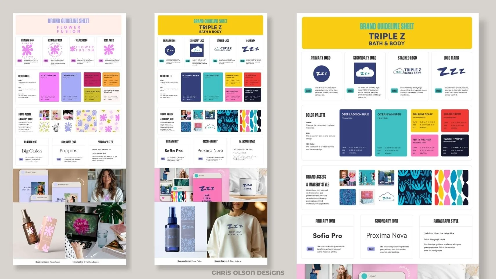
My clients love the convenience of having all essential brand elements on a single page. Say goodbye to sifting through lengthy 40+ page manuals! With my one-sheet solution, you'll quickly grasp your brand's key features without the hassle. It's simple, practical, and designed to streamline your workflow.
But don't worry - I’ve also got you covered with an additional comprehensive brand guideline document, ensuring consistency across platforms and mediums.
My clients like the option of getting all their brand essentials on a single, easy-to-use page. This means you can quickly grasp your brand's key features without sifting through a hefty 40+ page manual. It's straightforward, handy, and designed to make your life easier! The above image is an example of a one-page brand guidelines sheet that includes a logo suite, color palette, typography, brand assets and imagery style.
What’s included in the one-page brand guideline sheet:
Logo Suite: Your brand guide includes sample images of various logo iterations, such as the Primary Logo, Secondary Logo, Stacked Logo, and Logo Mark. Each logo version is accompanied by a brief explanation of its intended usage.
A well-designed logo is a unique identifier that captures the essence of your brand identity in its simplest form. It should evoke instant recognition of your organization and convey the emotional appeal at the core of your brand. Although logos often appear simple, they are strategically designed and refined through an iterative process to effectively represent your brand's values and personality.
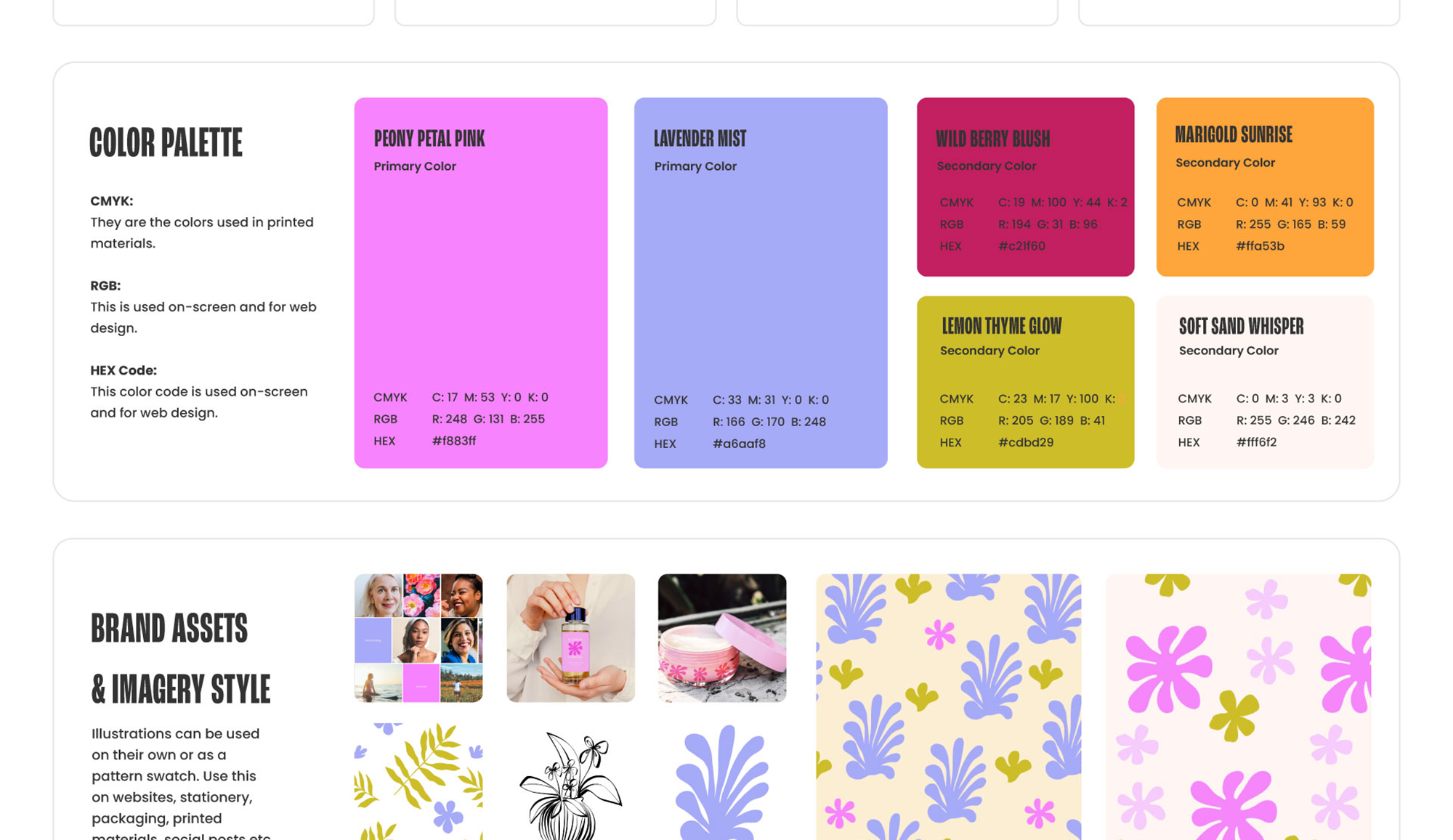
Here’s a sneak peek at the logo suite and color palette from the one sheet brand guide. Make it easier for your clients to understand their brand guide by offering clients a one-page brand overview and a detailed guide.
Color Palette: Your brand guidelines include all the necessary color codes for both print and digital applications. When selecting your color palette, consider the emotions you want your brand to evoke, your target audience, and the various platforms where it will be showcased, such as your website and social media. This thoughtful approach will help create a strong and consistent visual identity across all channels.
Brand Assets and Imagery Style: Your brand guidelines include examples that set the tone and style for your brand imagery. To maintain a cohesive visual identity, ensure that all photos share a consistent look and feel, whether that's light and airy, moody, or bold and colorful. Consistency is key, so choose a style that aligns with your brand message and resonates with your target audience.
While stock photos can be useful, investing in custom brand photography will provide you with a unique collection of images that truly represent your business. This investment can elevate your brand and make it stand out in a crowded market.
Typography and Fonts: Your brand guidelines include samples and use cases for primary and secondary fonts, as well as recommendations for paragraph styles. To establish a strong typographic identity, develop consistent guidelines for handling key text elements such as your tagline or address. By consistently styling and positioning headlines and pull-out text, you'll create a distinct and recognizable brand voice. Aim for consistency in typography across all applications to reinforce your brand's visual cohesiveness.
Here’s a close-up view of the color palette and sample brand assets and imagery style from the one sheet guide.
Are you a design studio or brand seeking a skilled freelancer for your branding projects? Let's connect and make branding magic happen.More Good Stuff for Creatives
Here are a few blog posts with quick and easy tutorials to help you in your creative work.
How Creating Mood Boards Enhances Brand Identity Projects
Two sample visual inspiration boards for a brand identity project, featuring a curated mix of color swatches, textures, patterns, and imagery in warm and cool palettes to explore creative directions and design concepts.
Sample slides from a guest outreach presentation for a podcast.
Streamline Your Process: More Tips for Creatives
Yep, I wrote these too — more pro insights to simplify your creative process.


